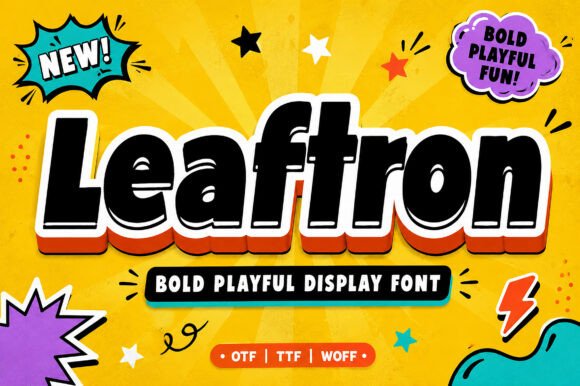
Leaftron: A Playful Display Font for Bold Digital Branding
As a UI designer who ships landing pages, SaaS dashboards, and e-commerce experiences, I reach for display fonts not just to decorate—but to direct attention, reinforce voice, and accelerate recognition. Leaftron fits that need precisely: it’s a chunky, cartoon-inspired display font built for digital impact without sacrificing clarity. Its letterforms are generous, slightly rounded, and full of rhythmic energy—think friendly confidence, not forced whimsy. That personality lands immediately on screen, especially in high-visibility areas where tone matters as much as hierarchy.
Leaftron shines where users make snap decisions: hero sections, product headlines, CTA buttons, and shop banners. On a coaching website’s hero, “Start Your Journey” in Leaftron—paired with a clean sans serif like Inter or Manrope for body text—creates instant warmth and approachability. In an online boutique’s seasonal banner (“Summer Drop Live!”), its bold weight holds up against background imagery and scales cleanly across breakpoints. Because Leaftron is designed for display use—not long-form reading—it avoids the pitfalls of low-contrast or overly stylized typefaces: no squinting on mobile, no blurred rendering at 48px on retina displays.
Readability isn’t about neutrality—it’s about intention. Leaftron prioritizes legibility at scale: wide apertures, open counters, and consistent stroke contrast ensure characters remain distinct even at smaller heading sizes (down to ~32px on desktop, ~28px on mobile). It performs reliably over both light and dark backgrounds, though I recommend avoiding pure black-on-white for extended use—try charcoal or deep navy instead to soften visual intensity. When layered over photos or gradients, a subtle text shadow or background tint helps maintain contrast without compromising vibrancy.
Where Leaftron excels most is in reinforcing brand tone without needing illustration or animation. A creative portfolio site using Leaftron for project titles (“Brand Identity Refresh”, “UI Kit Launch”) signals playfulness and craft—before the first case study loads. A kids’ learning app uses it for section headers (“Let’s Build!”, “Try This!”) to mirror the energy of its audience. Even in B2B contexts—say, a design tool’s feature announcement page—Leaftron adds human rhythm to technical content, making complex updates feel accessible and inviting.
It’s not a workhorse font—and it shouldn’t be. Leaftron is intentionally single-purpose: a display font engineered for short bursts of high-impact text. Don’t use it for navigation labels, form fields, or paragraph copy. Do use it for logo lockups (where supported by licensing), social media cover graphics, email subject lines, and animated micro-interactions like hover states on premium CTAs. Its personality works best when anchored by typographic contrast—so always pair it with a highly legible, neutral sans serif for UI text and body content. For editorial-leaning digital products—like a newsletter platform or creative blog—I’ll sometimes layer it with a restrained serif (e.g., Lora or Crimson Pro) for subheads, letting Leaftron handle only the boldest, most emotionally charged moments.
Leaftron ships with standard OpenType features and webfont formats (WOFF2 included), so it integrates smoothly into modern CSS workflows via @font-face or CDN-based font services. Check the package for stylistic alternates—some versions include playful ligatures or rounded terminals that add subtle variation in logos or short slogans. While currently optimized for Latin-based languages, verify multilingual support if your audience spans accented or non-Latin scripts. And crucially: confirm commercial licensing covers your use case—especially for client websites, SaaS platforms, digital templates, and online stores. Most reputable vendors offer clear web embedding rights, but always review scope: self-hosted vs. third-party hosting, pageview limits, and redistribution permissions matter when shipping production assets.
In practice, I test Leaftron early in layout exploration—not as decoration, but as a functional variable. Does it clarify the primary action? Does it align with the brand’s emotional promise? Does it hold up next to real interface elements (icons, cards, images)? I’ve seen it transform a generic “Get Started” button into a memorable moment simply by swapping in Leaftron at 20px with tight letter-spacing and a vibrant accent color. That’s not magic—it’s intentional typography doing its job.
For designers balancing creativity with conversion goals, Leaftron delivers measurable value: faster visual scanning, stronger brand recall, and more expressive hierarchy—all without sacrificing accessibility or performance. It’s not for every project, but when your digital experience needs unmistakable character—whether it’s a course sales page, a festival landing site, or a rebrand rollout—Leaftron gives you confident, joyful emphasis exactly where it counts.
- Best used for: Hero titles, section headers, CTA buttons, shop banners, logo accents, social graphics
- Avoid for: Body copy, navigation menus, data tables, small UI labels (<16px)
- Pair with: Neutral sans serifs (Inter, Poppins, Manrope) for UI/body; restrained serifs (Lora, Cormorant Garamond) for editorial contrast
- Responsive tip: Use
clamp()for fluid sizing—e.g.,font-size: clamp(1.5rem, 4vw, 3.5rem);—to keep impact consistent across devices - Licensing note: Verify web embedding rights cover your deployment method—especially for client work, templates, and SaaS applications